We analyzed more than 1 million tweets to pinpoint the best time, day, and post format for maximum engagement on X (formerly Twitter).
If Ali Abdaal can’t think of a sufficiently intriguing thumbnail for his video ideas, he won’t even make the video.
No matter how great the idea is, the YouTuber with 5 million subscribers revealed it’s not worth the effort of writing, recording, and editing a video if he doesn’t have a showstopper thumbnail for it — because no one is going to watch it.
But wait: YouTube is a video platform, so how much can a static image contribute to your content success? Surely you can scrub to a still from your video in YouTube Studio, and you’re good to go?
Turns out: not quite. There’s a good reason YouTuber MrBeast famously pays around $10,000 for a single thumbnail design and generates up to 20 options for each video.
According to YouTube, 90 percent of the best-performing videos have custom thumbnails (so, not the ones that the social media platform autograbs from your videos).
“Thumbnails are absolutely critical,” Paul O'Malley, whose YouTube channel on tips for improving efficiency, skyrocketed to success within a matter of months.
“They're often the first thing viewers see, and a compelling thumbnail is the often difference between someone clicking on your video or scrolling past it. In my content area, a better thumbnail can often be the deciding factor between my video being chosen over someone else's that might be covering the same topic.”
It makes sense: think about how you use YouTube as a viewer. How do you decide what videos to watch? There’s no way to gauge how interesting, funny, or helpful a video is going to be before you click on it beyond the thumbnail and the title.
Buffer’s Senior Product Designer, Alicja Suska, agrees. At the start of her journey with Outdraw Design, a channel that helps product designers level up, she went for simple thumbnails to free up time to focus on filming and editing her videos.
“I used my photo with a dark background and title written in highlighted text,” she says. “It was great for consistency and efficiency, but this style was simply boring. At some point, I performed a workshop with myself to explore five or six different styles and choose what works best.”
“Now, my thumbnails still include the most important elements, but they have more variety when it comes to color, more interesting backgrounds, and a more recognizable style.”
Paul went on a similar journey. “My thumbnails have definitely undergone a lot of refinement!” he says. “In the beginning, they tended to be simpler and often didn't include a lot to draw in the audience. They were pretty basic as I didn't really have a lot of experience in creating thumbnails, but I have worked on that over the last year or so.”
“Now, I focus on bold colors, clear visuals that tie in with the video's subject area, and concise, intriguing text that sparks curiosity.”
While this may feel overwhelming, especially if you’re a YouTube beginner, successful YouTube video thumbnails are fairly formulaic. In fact, a fascinating study of the most popular YouTube videos of 2020 found some definite patterns in these top videos’ thumbnails. While this study might be a touch dated, you’ll still see many of these elements used by the most-watched YouTubers today.
Here’s the secret sauce for making YouTube thumbnails that turn scrollers into viewers (without dropping $10,000).
How to make YouTube thumbnails
1. Use the right image dimensions
There’s nothing that says, “I don’t know what I’m doing on YouTube,” like a pixelated, stretched, or black-bordered thumbnail — which is why starting with the right dimensions is the first step in thumbnail success.
For full-length videos, the right YouTube thumbnail size is 1280 x 720 pixels. That’s an aspect ratio of 16:9, which will display correctly on all devices.
You can upload a file with a minimum width of 640 pixels, but it’s wise to stick to the 1280 x 720 dimensions so your thumbnail image displays perfectly.
JPG, GIF, and PNG files will work, but you’ll get a better-quality image with the latter option.
Here’s an example of the image dimensions for YouTube videos:
2. Opt for bold, bright colors
Paul believes high contrast elements are one of the keys to thumbnail success. “Bold, bright colors help your thumbnail stand out in a sea of videos,” he says. “I have a set of templates that I leverage that make the logo and text blocks really pop out.”
This is something the study I mentioned earlier found, too. Of the 740 most-watched videos they analyzed, 88 percent of thumbnails were vibrant and colorful.
This is one of the biggest changes Alicja made in her thumbnail design, and it’s certainly impacted views. Here’s a comparison of one of her earlier videos featuring her initial design to the newer one on the right.
While plenty of factors are at play here, it’s worth noting that the new thumbnail version has ten times the views of the older one on the left despite being uploaded more recently.
3. Feature a face showing emotion
Using an excited, shocked, or sad face is a favorite device of YouTubers the world over — and with good reason. According to the thumbnails study, 72 percent of the most popular videos on YouTube in 2020 “featured an image of a human, averaging 921,000 more views than those without a human face.”
Alicja notes that, if using an image of yourself or a guest, the picture should be a still from the video or a photo taken simultaneously. “Make sure you’re wearing the same clothes and hairstyle,” she says. “Otherwise, it will feel staged.”
She adds, “I think that showing emotions on your thumbnail, being shocked, happy, or sad, also catches the viewer’s attention.”
The data supports her feelings — visible emotion was another pattern that emerged in the thumbnail study. Researchers found that a display of certain feelings was another common feature in these top-performing videos. Content conveying sadness had the highest average view count (2.3 million), followed by joy and humor (1.5 million), then anger or fear (818,000).
What’s interesting to note here is that the research didn’t technically specify the emotion needs to be on a human face. Their findings, mentioned separately from the point on thumbnails featuring faces, were framed as “content conveying the emotion of…” — a loophole that Paul has taken advantage of.
Given that Paul’s videos are primarily screen recordings and voice-overs, he has chosen not to use his actual face on his thumbnails. He uses versions of his Apple Memoji (an emoji-like avatar of his face that you can create on iPhone and other tools). The avatars definitely convey emotion (and Paul’s viewership speaks for itself!).
"I used a Memoji for my channel profile photo originally — no real reason as to why — and kind of just decided to stick with that aesthetic," Paul says. "But it definitely does ease the work required from me as I have preset facial expressions already available to me that I can just rely on. And in a way, it's now something that people recognize in my thumbnails, too."
4. Include short, snappy text
Another attention-grabbing detail both Alicja and Paul swear by? Text.
While video titles are an immensely important factor in the YouTube algorithm, they may get lost in the scroll.
Viewers’ eyes are more likely to be drawn to the much larger, more colorful graphics on thumbnails — which is why it can be helpful to give them a little extra context about your video with some well-chosen words.
“A few words that pique curiosity and give viewers a reason to click,” Paul says. “Ideally, I try to keep this to six words or less but still interest the audience. More than that tends to result in a font that is too small to read easily.”
It’s worth stressing that keeping it simple is key — it’s one of MrBeast’s team’s main focus areas when mocking up thumbnails, Chucky Appleby, from MrBeast’s creative team, said in a recent interview.
“Make your thumbnail easy to understand so that when people look at it the first time, they’re saying, “I know what’s going on in this video, so I’m going to click on it.”
“If they have to spend 10 or 20 seconds to try to understand what’s going on in your thumbnail, they’re probably not going to be that invested, and they’re going to keep scrolling.”
5. Create a template for consistency
A recognizable brand is your best friend when making sure your content stands out from the crowd. A cohesive channel shows professionalism — a subtle signal to your audience that they can trust you and the content you produce.
It also encourages them to subscribe to your channel if they discover another of your videos and recognize the branding. To that end, I’d recommend creating a lightweight brand kit: a color palette, font, and graphic style that you use consistently across both your full-length videos and YouTube Shorts.
To make this process simple, it’s worth setting up a thumbnail template in your image editing tool of choice — software like Canva, Figma, Visme, and Adobe Photoshop make this really easy to do and are a must-try for YouTube thumbnail design.
In your thumbnail template, consider these design elements:
- Dimensions: 1280 x 720 pixels for full-length videos.
- Fonts: Choose at least one easy-to-read font (or go the extra mile with a font pairing — search “font pairing” in Pinterest for fonts that go well together).
- Color: Select a palette of cohesive colors (Pinterest can help here, too — search for “color palette.”)
Protip: While you can create a custom YouTube thumbnail template from scratch, design tools like Canva and Visme will have customizable YouTube thumbnail templates ready for you to tweak and make your own. Consider them your very own YouTube thumbnail makers.
How to add a thumbnail to your YouTube videos
Uploading a thumbnail to accompany your video is pretty simple. All you need to do is follow the upload process in YouTube Studio, the accompanying YouTube platform where creators can manage and upload their content. Here’s a quick step-by-step tutorial:
- Make sure you’re logged into your YouTube account, then head over to studio.youtube.com.
- Hit the Create button on the top right.
- Drag and drop your video file into the window, or click Select file to open your device folders.
- Here, you’ll be able to add your video title, description, playlist, and other important video information. It’s also where you’ll find the option to add a thumbnail right underneath the description text box. Click Upload thumbnail and choose the file you want to use.
- Click Next and, if needed, add additional video elements like subtitles, an end screen, or cards.
- Click Next again. On the Checks screen, you’ll see whether YouTube has cleared your video for use (found no copyright violations).
- Click Next and choose your visibility settings.
- Hit Publish.
5 YouTube thumbnail examples
Looking for inspiration? Here are some great examples of some of the best YouTube thumbnails I’ve come across. They’re eye-catching yet cohesive — and the proof of their success is in those stellar viewership numbers.
Ali Abdaal
One of my favorite YouTubers, Ali Abdaal, opts for a clean, professional aesthetic that will appear to his audience of students, aspiring entrepreneurs, and productivity nerds.
Notice how well-let his high-quality photos are, which makes them pop ahead of the more muted backdrops.
Call Her Daddy
The YouTube channel for the hit podcast Call Her Daddy features a straightforward approach: two fonts, two colors, and an emotive still from the podcast recording of host Alex Cooper and her guests.
What’s interesting, though, is how Alex (or, rather, her team) subtly edits the podcast title to make the thumbnail version even more intriguing and offer a peek at what juicy details viewers can expect the guest to discuss.
HealthNut Nutrition
Food and lifestyle blogger Nikole Goncalves (aka HealthNut) has clear brand colors and fonts she sticks to in every thumbnail — an aesthetic that carries across her other social media accounts, too, which is a nice touch.
Asia Jackson
Asia Jackson is a great example of knowing your target audience and how their preferences might impact the thumbnail best practices I’ve laid out above. She’s got a clear, consistent design style with clever on-thumbnail titles and the occasional emotive photo of her face.
However, the tones are muted (no bright, vibrant colors), and her designs focus on the aesthetics within her content (her outfits, decor, and daily life). She knows her subscribers come to her to emulate her style, and she puts that front and center with every thumbnail she creates.
MrBeast
What YouTube thumbnail advice article would be complete without mention of YouTube’s reigning creator, MrBeast? Notice how the YouTuber’s design team keeps every image eye-catching but easy to understand at a glance.
Chucky shared that the use of MrBeast’s (aka Jimmy Donaldson’s) face is also an intentional way to build trust with viewers. “In 2019 we decided to start putting Jimmy’s face in every thumbnail because we were branding the videos around him.”
“If you trusted Jimmy on the last video that he uploaded, and he delivered on the content, then the next video you see his face, and you’d be like, ‘Oh, that’s the guy that delivered on the last video I enjoyed so I’m going to click on this video as well.”
Share your thumbnail tips and tricks
Are there YouTubers whose video thumbnails should be on this list? Or have you cracked the code to your own thumbnails? We’d love to hear from you! Tag @buffer on social platforms, comment below, or join our Discord community.
Recommended Story For You :
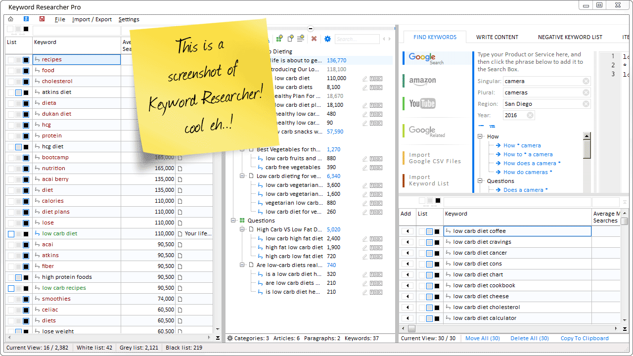
Organize Keywords and Import CSV Files from the Google Keyword Planner
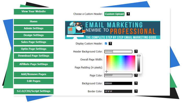
The Most Affordable And Easiest User Friendly Page Builder You Will Ever Use!

Instant WordPress Theme That Matches Your Website
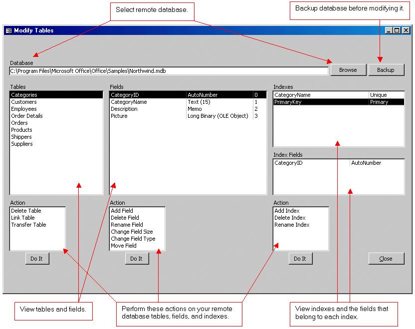
Wizard to Manage Remote Backend MS Access Database Tables Fields and Indexes

If you had an aisle-by-aisle grocery list wouldn't you spend less money on impulse items?
everything you need to create a professional corporate look mini-site is there.

Unlock Your Networking Potential with GNS3Vault
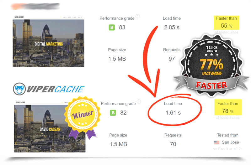
Viper Cache Was 77% Faster Than The Competetion

Understanding Stock Market Shorting eBook
