In this article, get ideas for your next LinkedIn carousel from different creators plus best practices to make this engaging format easy to produce.
LinkedIn carousels are a great content format for many reasons. First, the LinkedIn algorithm prioritizes this content format, probably thanks to the visual appeal and subsequent engagement. Much like Instagram carousels, they tend to be very appealing because they differentiate from the other types of content you might come across on your feed.
0:00
They also tend to perform quite well – I’ve only posted a few, but they tend to be one of my top-performing formats, a win for my personal branding efforts. And according to our internal data, they have the third-highest engagement rate after video and photo posts at 4.2 percent.
However, I’ll also be the first to admit that they can be difficult to work with, especially if your design skills are sorely limited. Thanks to tools like Canva (and our handy guide to creating and scheduling this format in Buffer), that hurdle is less difficult to climb – until you reach the next one: idea generation.
So, in this article, I’ll give you some ideas for your next carousel from different creators and share some best practices to make this engaging format easier than ever to produce.
1. Share news related to your industry
Keeping your audience informed about the latest industry news not only positions you as a knowledgeable source but also provides value to your followers.
Here are two creators who have mastered the art of sharing industry news through LinkedIn carousels:
Girl Power Marketing uses a distinct tone of voice and visual branding to share important social media updates.
Why this works: The carousel is visually appealing, and the information is presented in a concise, easy-to-understand format. This makes it easy for the audience to stay informed about the latest trends and changes in the social media landscape.
Pretty Little Marketer shares their favorite marketing moments of the year in a visually engaging carousel.
Why this works: By highlighting key campaigns and explaining their effectiveness, they provide valuable insights and learnings for her audience. The carousel is not only informative but also invites engagement by asking the audience to share their own favorite marketing moments.
2. Share company culture and employee highlights
Showcase your company's culture, values, and team members through a carousel. This can help build brand awareness, humanize your brand, and build trust with your audience. For instance, you could create a carousel featuring employee spotlights or behind-the-scenes glimpses of your office.
Beehiiv uses LinkedIn carousels to welcome new hires. In this post, they introduce two new employees, sharing their roles and expressing excitement about their joining the team.
Why this works: This approach works because it not only introduces new team members but also gives a sense of the company's growth and global reach. It creates a sense of community and shows that the company values its employees. This can help to attract potential employees and customers who value a strong, inclusive company culture.
Deel, an international company, uses LinkedIn carousels to highlight individual employees. In this post, they spotlight David Alejandro Lira, expressing their excitement about having him on board and hinting at his potential future influence.
Why this works: This approach works because it puts a face to the company, making it more relatable and human. It also shows that the company values its employees and their individual contributions. This can help to build trust with potential employees and customers, who may be more likely to engage with a company that values its people.
3. Give step-by-step instructions and advice
Use carousels to provide step-by-step instructions or guides. This can be useful for sharing how-to content, tutorials, or tips. For example, you could create a carousel that walks users through setting up a specific software or tool.
Jay Clouse shares a guide to posting over the holiday season. He provides a step-by-step approach to repurposing content and scheduling posts.
Why this works: This approach provides actionable tips clearly and concisely. The step-by-step format makes it easy for the audience to follow along and implement the advice. Additionally, the timely nature of the content (posting over the holiday season) makes it particularly relevant and useful for the audience.
Alex shares five things everyone should know about strategy. He breaks down complex strategic concepts into easily digestible points.
Why this works: This approach simplifies complex ideas (strategy) into easily understandable points. The use of a numbered list helps to structure the content and guide the reader through the key points. This makes the content more accessible and engaging, helping the audience to better understand and apply the concepts.
4. Share interesting information and facts
Sharing interesting facts, trivia, or insights related to your industry or niche can position you as a thought leader and engage your audience. For instance, you could create a carousel highlighting little-known facts about your industry.
Mad Over Marketing shares an interesting fact about how Heinz is fighting ketchup fraud with a genius hack, 'The Label of Truth.'
Why this works: This approach works because it shares an intriguing story about a well-known brand, which can capture the audience's attention. The post also highlights the brand's innovation and customer-centric thinking, which can inspire other businesses and marketers. The information is presented in a fun and engaging way, making it more likely to be shared and remembered by the audience.
Verneri Brander shares a comparison between Claude AI and ChatGPT for email marketing. He provides insights into how these AI tools can be used to create effective email marketing campaigns.
Why this works: This approach works because it provides valuable insights into a trending topic (AI in email marketing). The post not only shares information but also provides a practical application, making it more useful for the audience. By sharing his experiences and opinions, Verneri adds a personal touch to the post, making it more relatable and engaging.
5. Turn complex data and ideas into easily digestible frames
Transforming complex data or information into visually appealing slides is an excellent way to make your content more accessible and engaging.
For example, you could create a carousel that breaks down a complex topic or showcases key statistics to help your audience better understand and retain the information.
Here are some creators who excel at turning complex data and ideas into easily digestible frames:
Why this works: Josue's carousel effectively breaks down his content system into simple, actionable steps. The clean and consistent visuals make it easy for the audience to follow along and understand the process.
Why this works: Chase's carousel highlights three design principles from an eye-catching ad. The carousel itself is visually appealing, with clear and concise explanations that make it easy for the audience to grasp the concepts and apply them to their own marketing efforts.
Why this works: Erica's carousel focuses on the importance of parallelism in writing. By using clear examples and explanations, she helps her audience understand the concept and how to apply it to their own writing. The visuals are simple and consistent, making the content easy to digest.
6. Showcase your products or services
Use carousels to showcase your products or services in a visually appealing way. By highlighting different features, benefits, or use cases with each slide, you can demonstrate how your product solves a specific problem for your target audience. For example, you could create a carousel demonstrating how your product solves a specific problem for your target audience.
Jens Joseph Mannanal, Co-founder & COO at Passionfroot, shares a case study of how Superhuman, one of the biggest and fastest-growing AI newsletters globally, leverages Passionfroot to streamline their workflow and sponsorship process.
Why this works: This approach works because it provides a real-world example of how the product (Passionfroot) solves a specific problem (inefficient and inconvenient ways of organizing sponsorships and tracking payments). The post also includes a testimonial, which adds credibility and shows the product's value. The carousel format allows for a detailed breakdown of the problem, solution, and results, making the case study easy to follow and understand.
Remote, a company that provides solutions for global employment, shares information about hiring talent in Portugal. The post highlights their services, such as visa sponsorship and standard onboarding processes.
Why this works: This approach works because it provides valuable information related to the company's services. By addressing potential challenges (like visa applications and health checks) and explaining how their services can help, Remote positions itself as a solution provider. This makes the content more accessible and engaging, helping the audience to better understand the services offered by Remote.
7. Create zero-click content from your existing media
Zero-click content offers valuable, standalone insights or engaging material without users needing to click on a link.
While clicking might provide additional information, it's not required for users to gain value from the content. Here are some examples of great zero-click content pulled from existing media.
We shared tips on creating content pillars for social media platforms, providing a clear and organized framework for content creation.
Why this works: This approach offers valuable insights and advice directly within the carousel without requiring users to read the whole article. The content is concise, visually appealing, and easy to understand, making it more likely to be shared and remembered by the audience.
SparkToro shares research findings on how much web traffic social networks send without correct attribution, shedding light on the undercounting of social media and word-of-mouth referral traffic.
Why this works: This approach presents intriguing research findings directly within the carousel, making it easy for users to grasp the key points without clicking a link. The content is informative and thought-provoking, which can help position SparkToro as a thought leader and engage its audience.
8. Share collaborative content
Elevate your content by embracing the power of collaboration. Collaborative content not only provides a fresh perspective to your audience but also expands your reach by tapping into the networks of your collaborators. This strategy can be particularly effective on platforms like LinkedIn, where professional networks intersect and overlap.
In this post, Ryan Musselman collaborates with Richard van der Blom to share insights on how to create a LinkedIn banner that positions you as an expert and attracts your ideal customers. The post provides a clear, step-by-step guide, complete with examples and ideas for incorporating social proof into your LinkedIn banner.
Why this works: This approach works because it combines the expertise of two thought leaders, providing a comprehensive guide that is both practical and actionable. By collaborating with Richard, Ryan can offer his audience a fresh perspective and additional insights. The post encourages engagement by inviting the audience to follow and support Richard's content. This not only provides value to Ryan's audience but also helps to expand Richard's reach, creating a win-win situation for both parties.
In this post, Thinkific promotes a webinar featuring Jon Youshaei, a top creator and educator.
Why this works: This post works because it offers direct value to Thinkific's audience, who are likely interested in the topic of conversation. By bringing in an expert like Youshaei, Thinkific can provide high-quality, relevant content to its audience. Furthermore, the promise of a special offer creates an additional incentive for viewers to attend the webinar.
9. Sharing thought leadership or how-to content
Share your expertise and knowledge through carousels that provide valuable insights, tips, or advice. This can help establish you as an authority in your field and attract new followers. For instance, you could create a carousel that offers tips for improving productivity or shares insights on industry trends.
Why this works: The post combines personal storytelling with educational content. Lara's story resonates with her audience, and her SLAY framework provides actionable advice that others can apply to their own LinkedIn strategies
Why this works: Sam’s post empowers the audience to share their own experiences and learnings rather than conforming to generic content norms. It also promotes the idea that LinkedIn can be a platform for genuine connections and personal growth, not just business transactions.
Why this works: This post works because it challenges conventional wisdom and offers a fresh perspective on content creation.
10. Highlight members of your audience or community
Highlighting members of your audience or community is a powerful strategy to foster engagement and build a sense of belonging.
Passionfroot showcases the work of various creators in their "Creator Gallery." This not only highlights the creators' specialties but also provides them with potential sponsorship opportunities.
Why this works: By showcasing the creators that are part of its clientele, Passionfroot is not only promoting their work but also building a sense of community. This strategy can lead to increased engagement, as creators feel recognized and valued, and it can also attract new creators to the platform.
Klaviyo has built a thriving community where users and partners can learn, grow, and share tips on enhancing their ecommerce businesses. They encourage active participation and even suggest that members search the community for answers before starting a new thread.
Why this works: This approach not only fosters a sense of community but also positions Klaviyo as a valuable resource hub. It encourages peer-to-peer learning and engagement, which can lead to increased customer loyalty and brand advocacy.
ConvertKit highlights how Allea Grummert navigates the challenge of recommending other creators without shifting her audience's attention away from her own work.
Why this works: This approach provides valuable insights to other creators and fosters a sense of community. It also positions ConvertKit as a thought leader in the creator economy, offering practical advice and solutions to common challenges.
11. Share micro interviews
Micro interviews are a concise and engaging way to share insights from industry experts or thought leaders. These bite-sized interviews can provide valuable information to your audience in a digestible format, making them ideal for platforms like LinkedIn, where users often consume content on the go.
In this post, Eddie Shleyner, founder of VeryGoodCopy.com, shares a 165-word "Micro-Interview" with copywriter, creative director, and author Cameron Day. The interview is concise, with clear questions and answers, providing valuable insights without wasting the audience's time
Why this works: This approach provides valuable insights in a concise and engaging format. The micro-interview format respects the audience's time, making it more likely for them to engage with the content. Additionally, by featuring an industry expert, Eddie can provide his audience with unique insights and perspectives, further enhancing the value of his content.
Best practices to consider when creating LinkedIn carousel posts
Creating a LinkedIn carousel that stands out and engages your audience requires a blend of creativity, strategy, and attention to detail.
We’re not afraid to defer to the expert, and no one has more LinkedIn expertise than Richard van der Blom, an expert LinkedIn consultant. He shared some best practices for LinkedIn carousels that are immensely valuable, which we’ve incorporated into the following list.
- Structure your carousel for easy consumption: Aim for around 12 slides, with 25-50 words per slide and 500 characters to keep your content digestible and maintain audience interest.
- Tell a story: Use your carousel to take the reader on a journey, whether sharing insights, presenting a case study, or explaining a concept. This storytelling approach helps to engage your audience and make your content memorable.
- Include a clear call-to-action (CTA): What do you want your audience to do after viewing your carousel? Whether it's visiting your website, signing up for a newsletter, or downloading a resource, make sure to include a clear and compelling CTA.
- Maintain consistent visual branding: Design your carousels with your brand's colors, fonts, and style to create a cohesive and recognizable look. This consistency helps to reinforce your brand identity and make your content stand out in the feed.
- Optimize for mobile viewing: Since many LinkedIn users access the platform on their mobile devices, ensure your text is large enough to read and your visuals are clear on smaller screens. This will improve the user experience and increase engagement.
There are also a few common threads across the examples we’ve shared that can help you improve your LinkedIn carousels. The most successful carousels:
- Distill necessary information for their audience into a digestible and fun-to-read format.
- Distinct branding and visuals that stay consistent week over week.
- Does the work for the audience by pulling from different sources for one cohesive piece of content.
- Transforms complex data and information into easily digestible frames.
As you explore these ideas, remember to create carousel content that’s engaging, visually appealing, and relevant to your audience.
Recommended Story For You :
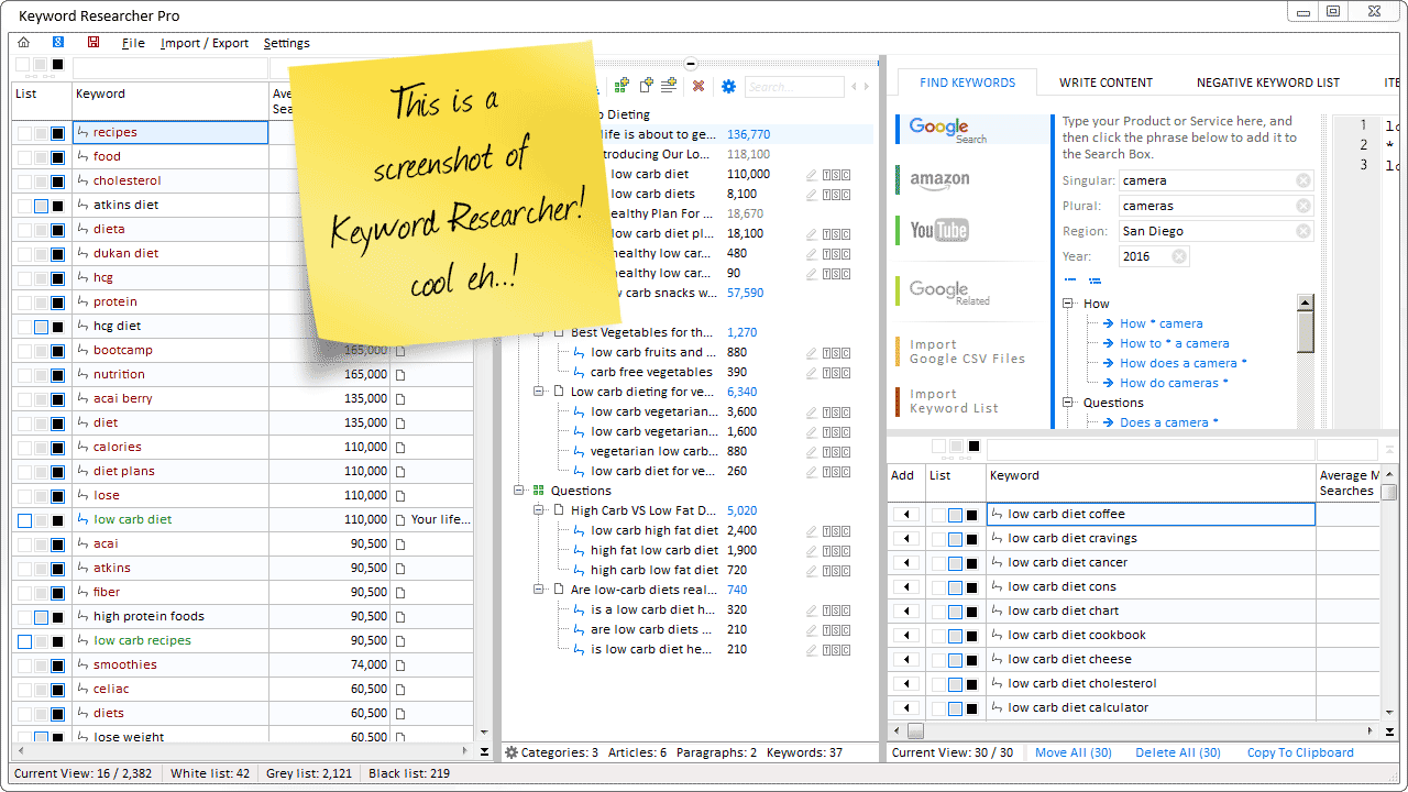
Organize Keywords and Import CSV Files from the Google Keyword Planner
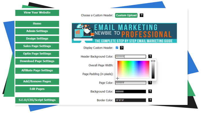
The Most Affordable And Easiest User Friendly Page Builder You Will Ever Use!

Instant WordPress Theme That Matches Your Website
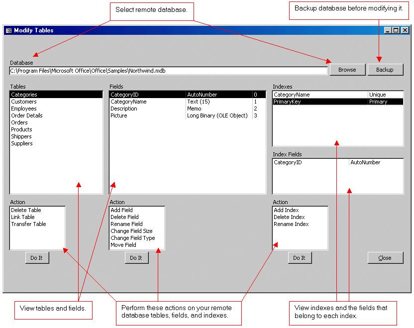
Wizard to Manage Remote Backend MS Access Database Tables Fields and Indexes

If you had an aisle-by-aisle grocery list wouldn't you spend less money on impulse items?
everything you need to create a professional corporate look mini-site is there.

Unlock Your Networking Potential with GNS3Vault
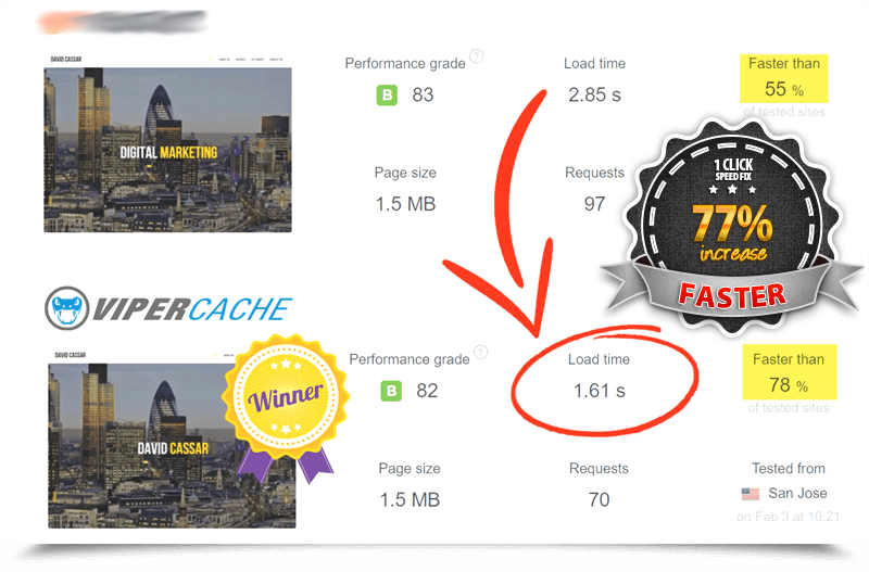
Viper Cache Was 77% Faster Than The Competetion

Understanding Stock Market Shorting eBook
